Pivot Reports
Pivot Reports in DriveMetaData help you analyze omnichannel campaign performance through a flexible, interactive pivot table. You can choose row groups, column labels, measures, filters, and date ranges to create cross-tabulated marketing reports without technical knowledge.
What is a Pivot Report?
A pivot report organises your data into a grid. Imagine a spreadsheet where:
- The rows show one category (for example, each campaign name).
- The columns show another category (for example, each channel — Email, SMS, Push).
- The cells show a number at every intersection (for example, total messages sent).
This lets you spot patterns at a glance — like which channel performs best for a particular campaign — without manually sorting through raw data.
Finding Your Reports
Navigate to Pivot Reports from the main menu. You will see a list of all reports you have already created, sorted from newest to oldest.
- Search — type any part of a report name in the search bar to filter the list instantly.
- Open — click anywhere on a report row (or the open icon) to go into that report.
- Delete — click the delete icon on any row. You will be asked to confirm before the report is permanently removed.
If the list is empty, you will see a prompt to create your first report.
Creating a New Report
Click the New Report button in the top-right corner of the list page.
A small form appears asking for:
- Name (required) — give your report a clear, descriptive name so you can find it later.
- Description (optional) — a short note about what this report is for.
Click Create and you will be taken straight into the report builder, ready to start building.
Inside the Report Builder
The report builder is a full-screen workspace. Here is a quick orientation:
- Top bar — your report name, a back button, and a shortcut to jump to other reports.
- Controls strip — date range selector and filters, sitting just below the top bar.
- Main area — split into the data table on the left and a configuration panel on the right.
- Action bar — Run, Save, and Reset buttons along the bottom.
Renaming Your Report
Click directly on the report name (bold text in the top bar) to edit it in place. Press Enter or click somewhere else to save the new name. You can update the description the same way — it sits just below the name in smaller text.
Switching Between Reports
Click Show other pivots in the top-right corner of the header. A panel drops down showing all your other saved reports as cards. Click any card to switch to that report instantly. You can search within the panel if you have many reports.
Choosing a Date Range
The date range toolbar controls which time period your data covers. You will find it at the top of the builder.
Quick options:
| Button | What it shows |
|---|---|
| 7D | The last 7 days |
| 30D | The last 30 days |
| 3M | The last 3 months |
| 12M | The last 12 months |
| This year | From January 1st to today |
| This quarter | The current quarter to date |
| This month | The current month to date |
Click any button to apply it immediately — the active period is highlighted.
For a specific date window, click the calendar icon at the end of the toolbar and pick your own start and end dates.
Adding Filters
Filters let you focus your report on a specific subset of data. For example, show only records where the channel is "Email", or only records from a particular country.
- Click + Add filter in the filter bar.
- Choose a field from the dropdown — this is the piece of information you want to filter by.
- Choose a condition:
- Equals — must match one of the values you pick.
- Not Equals — must not match.
- Contains — the value includes the text you type.
- Starts With / Ends With — for text that begins or ends with something specific.
- Select one or more values. Options load automatically from your data as you type.
- Click Done.
Your filter appears as a small tag (chip) in the bar. When you have finished adding filters, click Apply to update the report. To start over, click Clear.
To edit a filter — click its chip. To remove one — click the × on the chip.
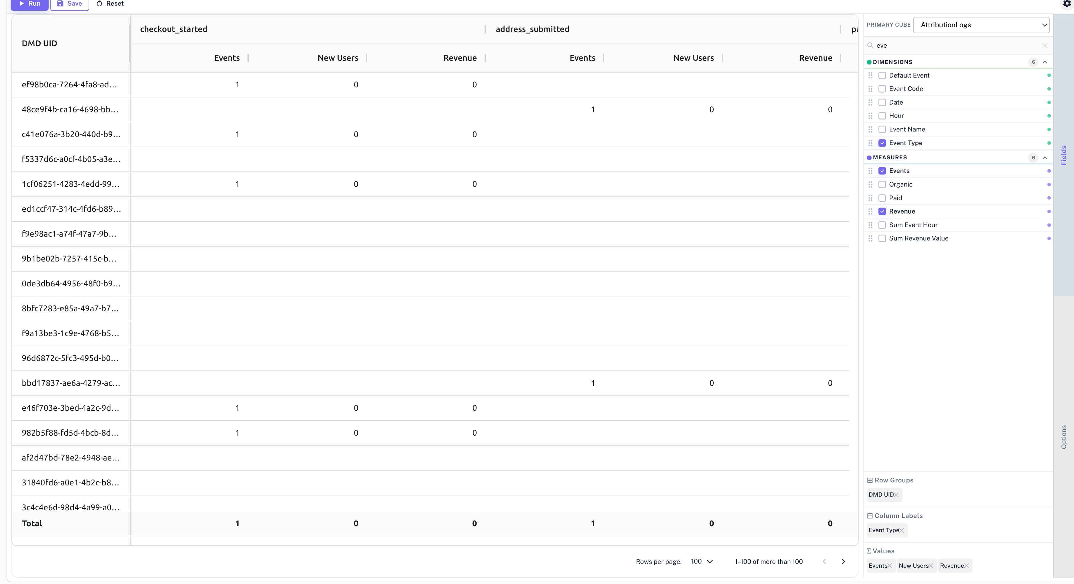
Building Your Table Layout
The Fields panel on the right side of the screen is where you decide what goes where in your table.
At the top of the panel is a Data Model dropdown. This selects the dataset you are reporting on. Each data model has its own set of available fields.
Below the dropdown you will see all available fields, split into two groups:
- 🟢 Dimensions — descriptive categories like Channel, Country, Campaign Name, or Date.
- 🔵 Measures — numbers like Total Sent, Opens, Clicks, or Conversions.
Adding fields — two ways:
- Checkbox — tick the checkbox next to a field to add it. Dimensions go to Rows by default; Measures go to Values.
- Drag and drop — grab a field by its drag handle and drop it directly into one of the three zones at the bottom of the panel.
The three zones:
| Zone | What it does |
|---|---|
| Row Groups | Each unique value of this field becomes a separate row. Add multiple fields to create nested rows (e.g. Country → City). |
| Column Labels | Each unique value becomes a separate column. Great for comparing categories side by side. |
| Values | The number shown in each cell, where a row and column intersect. |
To remove a field from a zone, click the × on its tag. To rearrange, drag tags between zones.
You can use a field as a Row Group and also filter by it at the same time — they work independently.
Display Options
Click the Options tab (next to Fields in the right panel) to adjust how the table looks:
- Show Row Subtotals — adds a summary row after each group.
- Show Column Subtotals — adds a summary column after each group.
These do not change the underlying data, only how it is presented.
Running the Report
Once you are happy with your layout, filters, and date range, click the ▶ Run button in the action bar. The table will populate with your results.
The Run button is temporarily disabled while results are loading. The previous results remain visible until the new ones are ready.
Saving Your Report
Your report saves automatically a couple of seconds after any change. You do not need to do anything — the builder takes care of it in the background.
If you want to save immediately and get a confirmation, click the 💾 Save button. A brief success message will appear.
If you want to throw away any unsaved changes and go back to the last saved version, click ↺ Reset.
Reading the Results
After clicking Run, your data appears in the table.
- The left-most columns show your Row Group values.
- The top columns show your Column Label values, organised into groups if you used more than one field.
- The cells in the middle show your metric values.
- A Grand Total row appears at the very bottom, summarising everything.
- Subtotal rows appear within groups when that option is turned on.
Sorting Columns
Click any column header to sort the table by that column — ascending first, then descending on a second click.
Navigating Pages
For large reports, use the controls at the bottom of the table to page through results. You can also choose how many rows to show at a time: 50, 100, 250, or 500.
Drilling Into a Cell
Click any value cell in the table to see the individual records that make up that number. A detail view opens showing the underlying rows — useful for investigating a specific data point or spot-checking your results.
The detail view is sortable by any column.
Warnings and Errors
The builder continuously checks your report as you configure it. If something needs your attention, a banner appears above the table.
| Colour | Meaning |
|---|---|
| 🔴 Red | Something is preventing the report from running. Fix the issue described in the banner before you can Run or Save. |
| 🟡 Yellow | A potential problem — the report can still run, but you may want to review it. Click × to dismiss. |
| 🔵 Blue | An informational note. Click × to dismiss. |
If the report configuration would produce an extremely large table, the banner will also show an estimated size and may ask you to confirm before running, or ask you to narrow your selection first.
Your Changes Are Always Saved
The builder protects your work in two ways:
- Auto-save — every change you make is saved to the server automatically within a couple of seconds. You never need to remember to save.
- Draft recovery — if you accidentally leave the page and come back in the same browser session, your unsaved changes are restored automatically so you can pick up exactly where you left off.
Example Reports You Can Build
Channel Performance Over Time
Show how each channel (Email, SMS, Push, WhatsApp) performs week by week.
- Rows: Week
- Columns: Channel
- Values: Total Sent, Opens, Clicks
- Date range: Last 3 months
Campaign Engagement Summary
See all your campaigns in one table with their key engagement numbers.
- Rows: Campaign Name
- Values: Delivered, Opened, Clicked, Converted
- Date range: This quarter
Country vs. Channel Heatmap
Find out which channels resonate most in each country.
- Rows: Country
- Columns: Channel
- Values: Unique Opens
- Filter: Status = Delivered
Daily Funnel View
Track your send → open → click → convert funnel day by day. For a dedicated funnel analysis view, see Funnel Reports. Click any cell to see the individual contacts behind that number.
- Rows: Date
- Values: Sent, Opened, Clicked, Converted
- Date range: Last 7 days
For metric definitions used across reports, see the KPI Glossary. To analyze repeat engagement over time, see Retention Reports.
Pivot Report FAQs
What is a pivot report used for?
A pivot report is used to summarize large datasets by grouping dimensions, comparing categories, and calculating metrics across rows and columns.
Can I filter a pivot report?
Yes. You can filter pivot reports by fields such as channel, campaign, country, status, or other available data model attributes.
Can I save a pivot report?
Yes. Pivot reports are saved automatically, and you can also click Save to confirm changes immediately.